Is it no surprise how practical design and typography has changed over the years with the advent of technology and better understanding of how the brain interprets information quickly – such as in the situation of typography on a sign. There are times when form follows function, and this brings with it specific constraints in the design decision-making process.
Perhaps, sometimes, though, it is OK to still think differently, and make conscious choices not to simply accept ‘rules’ that should be applied to make ‘good’ design based on the advancement of technology and human understanding. So, can modern understanding of typography make it more practical and less creative?
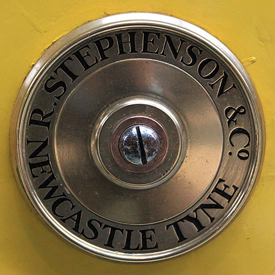
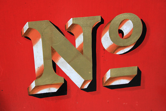
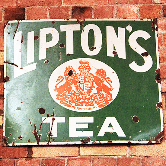
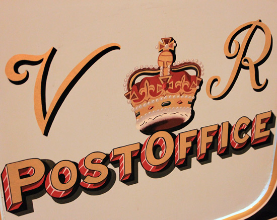
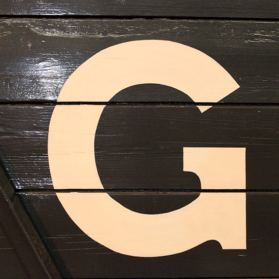
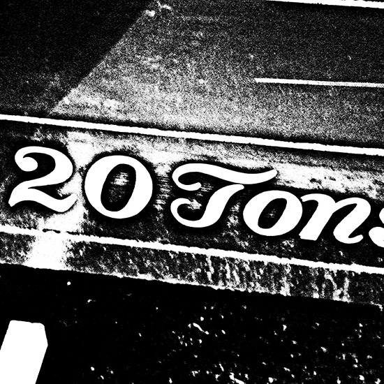
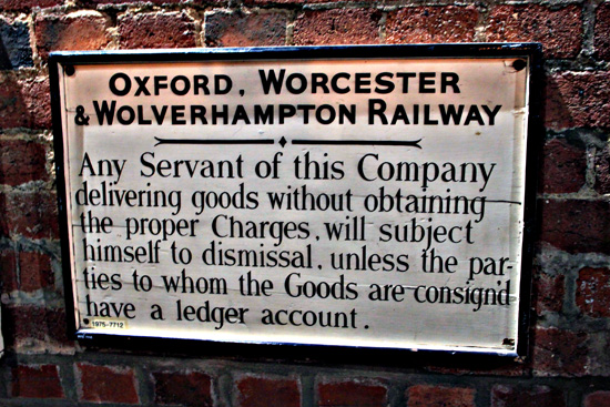
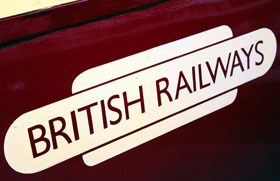
With the question above in mind, below are some close-ups and examples of typography from the railways in history – including logos, names, information blocks etc. See if you can spot the odd ones out being a lot newer than others and more clinical! Sorry that some of the images shown are a bit blurred.
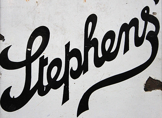
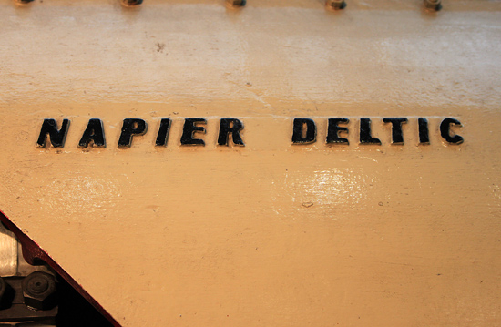
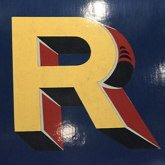
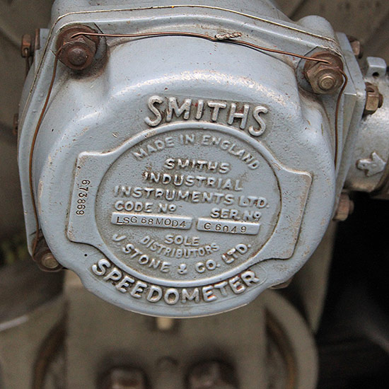

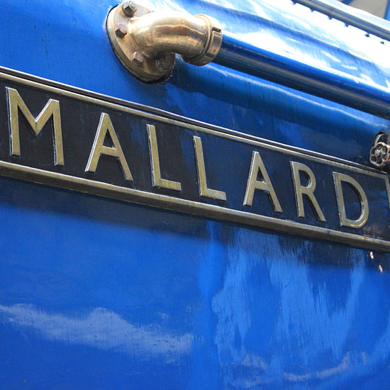
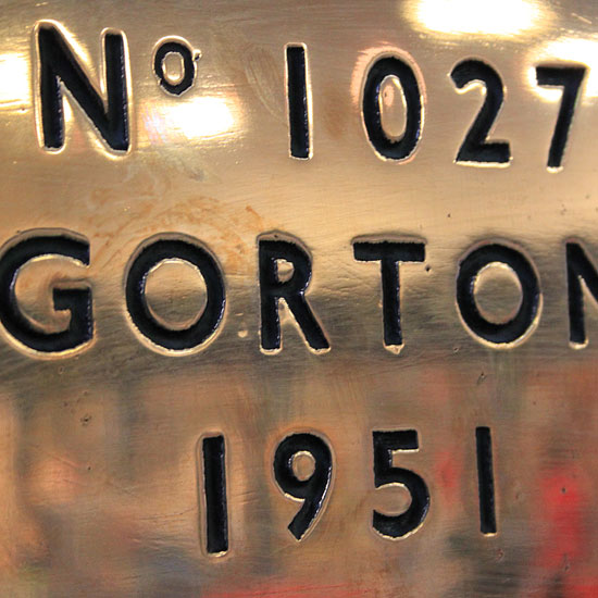
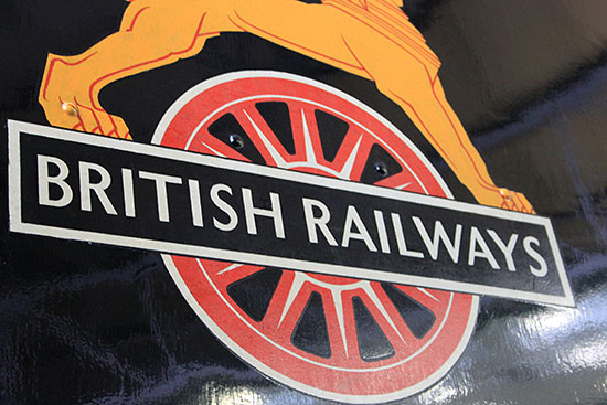
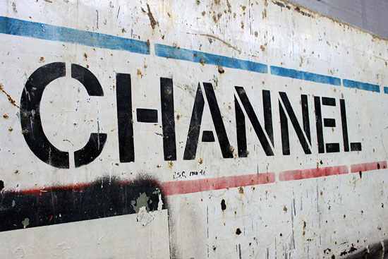
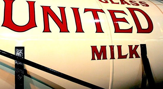
So, can modern understanding of typography and modern techniques make it more practical and less creative?…or has it not really fundamentally changed at all but just evolved?
Let us know your thoughts below…
Further inspiration…
A search for modern information sign design
More images of railway typography
A search for traditional and old font art
A search for typography design images


